

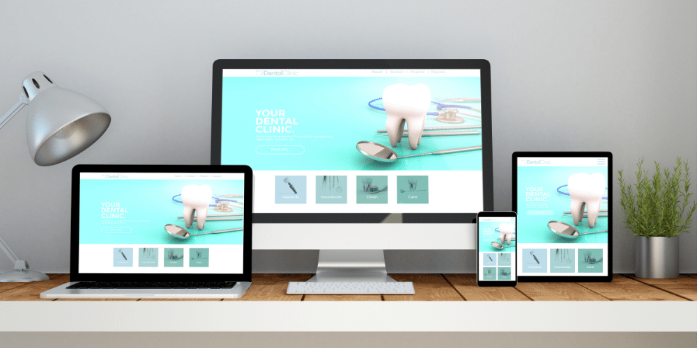
The Power of Responsive Web Design
Having a website that works seamlessly across different devices and screen sizes has become necessary for success. On average 55% of users check out websites from their mobile devices and some websites see up to 85% of their web traffic comes from cell phones and tablets. With the increasing use of smartphones, tablets, and a wide range of other devices, it’s essential for businesses to adopt responsive web design. At Internet Marketing Geeks, we understand the importance of creating websites that provide an optimal user experience on all devices and we want to share some key elements with you for your next build.
Understanding Responsive Web Design
Creating websites that adapt and perform seamlessly across a range of screen sizes is what responsive web design is all about; it’s more than just a technical term. Your website should work on desktops, tablets, and phones.
The Flexibility of Fluid Grids
Responsive web design is built on the foundation of fluid grids and flexible layouts.
A fluid grid is a flexible layout that adjusts itself based on the size of the screen it’s being viewed on. Just like water can fill any container, a fluid grid can adjust its columns and rows to fit different screen sizes.
Instead of specifying fixed widths for elements like images and text boxes, a fluid grid uses relative units of measurement, such as percentages, to define the size of each element. So no matter what screen size you’re using, the website’s layout will automatically adjust to fit.
For example, let’s say you have a three-column layout on a desktop screen. Each column takes up 33% of the width. When you view the same website on a smaller screen, the columns might stack vertically, one on top of the other, so they can still be easily read and navigated.
This fluidity allows websites to look good and function well on a wide range of devices, from large desktop screens to tablets and smartphones. It ensures that users can access and interact with the content in a way that is comfortable and intuitive for them.
For business owners, this means that potential customers will enjoy a positive browsing experience whether they’re researching your services on their smartphone during a commute or exploring your products on a tablet at home.
The Power of Media Queries

In responsive design, media queries are a web designer’s best friend. They allow the website to detect the device the visitor is using and adjust its display accordingly.
A media query allows developers to apply different styles to a web page depending on the characteristics of the device it’s being viewed on. This could be the width and height of the viewport, the device’s orientation (landscape or portrait), and even the resolution of the screen.
In the world of web design, media queries work in a similar way to your wardrobe: casual clothes for hanging out with friends, business attire for work, and sportswear for the gym. You choose what to wear based on the situation or “query” at hand. Media queries allow websites to “wear” different styles based on the situation – in this case, the size and orientation of the screen it’s being viewed on.
For instance, a media query can instruct a website to display a three-column layout when viewed on a desktop computer, but switch to a single-column layout when viewed on a smartphone. This ensures that the website looks good and is easy to navigate no matter what device it’s being viewed on.
As a business owner, you want your website to stand out and be accessible to everyone. Media queries help achieve this by tailoring the user experience for specific devices, ensuring your website looks its best for every visitor.
Boosting SEO and User Satisfaction
Responsive web design can significantly enhance your Search Engine Optimization (SEO) efforts in numerous ways. It improves the user experience by ensuring a smooth and optimized experience on your site, regardless of the device being used. A more user-friendly website can decrease bounce rates and increase time spent on your site, signals that search engines interpret as quality indicators.
Responsive websites often have decreased load times across all devices. Google has confirmed faster page load speed as a ranking factor.
Finally, Google recommends responsive web design as the preferred mobile configuration. Following Google’s recommendations can improve your visibility in search results.
Considerations for Building a Responsive Website
Here are some considerations for when you build your next responsive website:
Prioritize Content
Small screens mean limited space, so prioritize content that truly matters. Focus on core messages, key services, and compelling visuals while reducing non-essential elements.
Optimize Images
Images can significantly impact loading times on mobile devices. Use responsive images that adapt to different screen sizes and resolutions. Compress images appropriately to strike a balance between quality and load time.
Condense Navigation
On mobile, navigation menus can become cumbersome. Use collapsible menus, hamburger icons, or simplified navigation to save space and enhance usability.
Font Legibility
Choose legible fonts that are easy to read on smaller screens. Avoid small font sizes and maintain a reasonable line height for comfortable reading.
Touch-Friendly Elements
Ensure buttons and interactive elements are large enough to be tapped easily with a fingertip. Leave ample space between clickable elements to prevent accidental clicks.
Limit Pop-ups
Mobile users find pop-ups intrusive and challenging to close on small screens. If necessary, use pop-ups sparingly or design them to be easily dismissible.
Test Across Devices
Test your responsive design on various devices, including smartphones, tablets, and different-sized screens. Consider using browser developer tools or online testing tools to ensure consistency and optimal performance.
Speed Optimization
Mobile users are often on slower connections. Optimize your website for speed by minimizing HTTP requests, using browser caching, and minimizing the use of large scripts.
Vertical Layout
Mobile screens are typically taller than they are wide. Organize content vertically, avoiding the need for users to scroll horizontally.
Test User Flow
Test the user flow on mobile devices to ensure that the path to essential information and conversions is smooth and intuitive.
Progressive Enhancement
Design with the concept of progressive enhancement in mind. Start with a solid, functional core experience and then add enhanced features for larger screens.
User Testing
Conduct user testing with actual mobile users to identify any usability issues or pain points that may arise from your responsive design.
By following these tips, you’ll be well on your way to creating a mobile-responsive website that provides an excellent user experience across a variety of devices. Remember that mobile responsiveness is not a one-time task but an ongoing effort to adapt to the ever-changing range of devices and user behaviors.

In today’s technology driven world, having a responsive website isn’t a luxury; it’s a necessity. As a small business owner, you have the opportunity to stand out from the crowd by embracing the power of responsive web design. By partnering with a digital marketing and web development agency who specializes in catering to small businesses, you can ensure that your online presence is engaging, accessible, and tailored to your audience’s needs. Elevate your small business with responsive web design, and watch as your digital presence becomes a key driver of success.